Visualization Views
When creating a project, users can assign up to 2 views to any node of the model - a primary view and a secondary view. Whenever the training progress reaches a specific node, the views configured for that node will be shown.
When a node has no assigned view, fluxTrainer will automatically try to assign a sensible default view. For the Source and all filters fluxTrainer will automatically create a primary view that displays the first output of the node. (What view is automatically created will depend on the kind of data the node outputs.) The secondary view will be empty by default. For sinks (which do not have outputs), no view will be created by default at all.
While the default views created by fluxTrainer always reference the data of the current node, manually created views can be configured to reference data of previous nodes in the training progress. For example, it is possible to configure a secondary view that shows the raw spectra of the Source so that they may be viewed in conjunction with another view of the current filter. (This was shown in the Adding a spectral chart view section when the first steps with fluxTrainer were demonstrated.)
Selections across all views are synchronized [1], so that when a selection is made in one view, this will have an effect on all other views. Selections are not affected by the current training progress, they will remain the same when stepping through the graph.
Creating Views
To create a view the user may click on either the Change Primary View or the Change Secondary View menu entry or toolbar button. This will open the window that allows the user to select a new view:
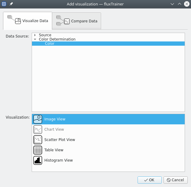
On the top there are two tabs that select the view category: views that visualize the data of a single output (Visualize Data), and views that compare the data of two outputs in a single plot (Compare Data).
When creating a view that visualizes the data of a single output, the window has two areas:
At the top the user sees a tree where they can select the output whose data they want to visualize. Only outputs of nodes up to the current node in the training progress are available here.
By default the first output of the current node will be selected.
At the bottom the user can select the type of view they want to create. The types that are enabled depend on the selected output, as not all data can be visualized in the same manner.
When creating a view that compares data of two outputs, the window will look like:
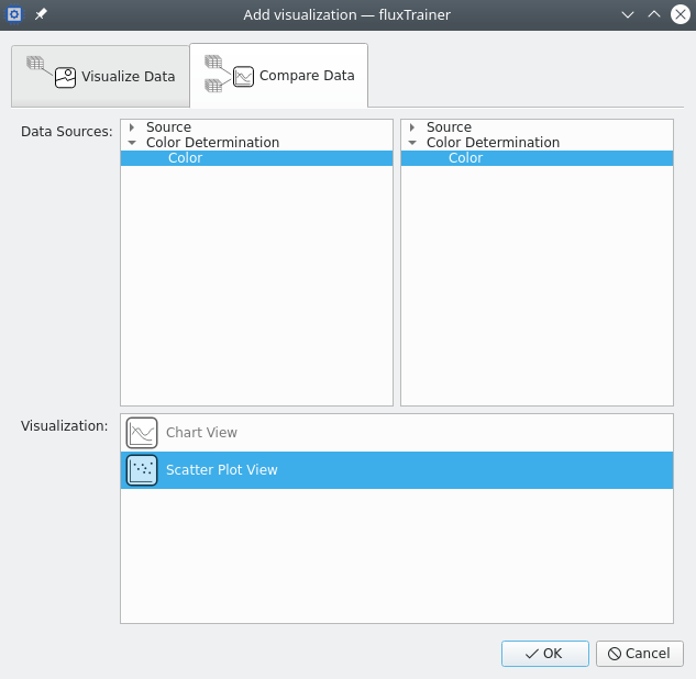
The top area of the window also allows the user to select the desired outputs, but in this case they must select two outputs to compare. Selecting the same output twice is allowed, but does not make much sense.
By default the first output of the current node will be selected for both.
The user may select the type of view in the bottom area of the window. The types that are enabled depend on the two selected outputs, and in some cases there are now views that can be used to compare data from two outputs - if the data does not have the same structure, for example.
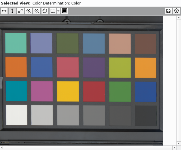
Image View
The image view maps each pixel of the data that is to be displayed to a pixel on the monitor of the user. An image view can only be created for data that is cube-like; it is not possible to create an image view for a list of spectra or objects, for example. [2]
The following screenshot shows how such an image view may look like:
The top bar of the image view allows the user to customize the view. It consists of the following buttons:
Scale to width: scales the image so that the width of the image fits the width of the view.
Scale to height: scales the image so that the height of the image fits the height of the view.
Original size: scales the image so that one pixel on the screen corresponds to one pixel of the image.
Zoom in: Switch to the zoom in tool. Clicking this once will exit any automatic scaling mode and switch to the zoom in tool. Clicking on a point in the image will zoom in by a factor of 2. Dragging a rectangle with the mouse within the image will ensure that the image is scaled as large as possible for that rectangle to still be inside the view. Clicking the zoom in tool again disables the zoom in tool and keeps the current scale factor.
Zoom out: Zoom out by a factor of 2. This also disables the zoom in tool, if active.
Pinpoint: Activates the pinpoint mode. (See below.)
Select: Enables the selection tool. This will automatically disable the zoom in tool (if active) and allow the user to select pixels. There are three different selection modes that the user can use. Clicking on the button directly will switch to the last-used selection mode of the view. (By default: rectangle.) Clicking on the small arrow button next to the actual selection button will open a drop-down where the user can choose the selection mode:
Select ellipse: The user may press the left mouse button and drag the mouse while it is pressed. This will span an ellipse. Upon release of the left mouse button the current selection will be replaced by all pixels in that ellipse or touching the border of that ellipse.
Select freehand: enables the freehand selection tool. This has two sub-modes.
The user may either press the left mouse button and generate a shape by dragging it within the image. When releasing the button the end point where the user released the button will be connected with the start point where the user initially pressed it, and all pixels within the shape that is enclosed by this contour will be selected.
Alternatively the user may click in the image once, then click at another point in the image again. This will start a polygon connecting each point clicked by the user by a straight line. To complete this type of selection the user must click on the first point of the polygon, at which point all pixels within that shape will be selected.
Holding the shift or control keys while completing new selections in either of these modes will not replace the current selection by the new shape, but either add the newly defined shape to the current selection (shift key), or subtract the newly defined shape from the current selection (control key).
Invert selection: this button inverts the selection in the current cube so that only pixels that the user had previously not selected are now selected, and vice-versa. If pixels from other cubes were previously selected those will be unselected entirely though. (And no pixels from other cubes will be selected.)
Export image: export the current image (in the current color map) as a PNG or JPEG image. The user will be prompted to select a filename to export the image as. (The user must select the desired format there.)
If the legend scale (see below) is visible in the view this will be included in the exported image. The area between the legend scale and the actual image will have a transparent background.
Configure: opens the settings window for the view. See below for details on what settings can be configured.
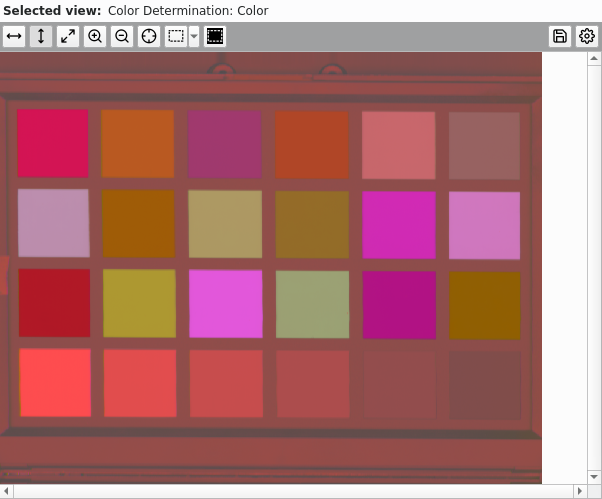
The image view has three primary display modes: Automatic Color Mode, Single Column Mode, and Three Column Mode. In the following subsections these modes will be explained.
Automatic Color Mode
This mode is only available if the input data that is being displayed has color values. If that is the case the image view will automatically convert those color values from whatever color space they are in so that they may be displayed on the computer monitor. [3]
This displays a color image in a manner that the human eye can easily interpret it.
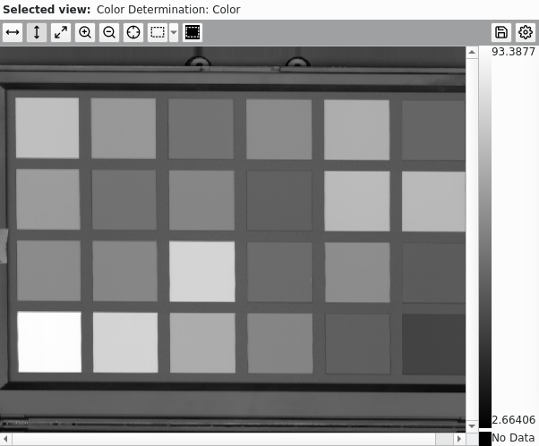
Single Column Mode
In this mode fluxTrainer will map a single channel/column of the input data to the image that is being displayed. A color map that the user can choose in the settings will be applied.
The user can specify which column to display in the settings window of the view. For some data sets the user can also choose to apply the color map to the average over all columns. [4]
Three Column Mode
In this mode the image view will allow the user to select three different columns of the data set, which will be used for the red, green, and blue components of an artificial false-color image that is shown to the user.
This mode is most useful when visualizing data that has been reduced in dimensionality, either via e.g. the PCA or LDA algorithms.
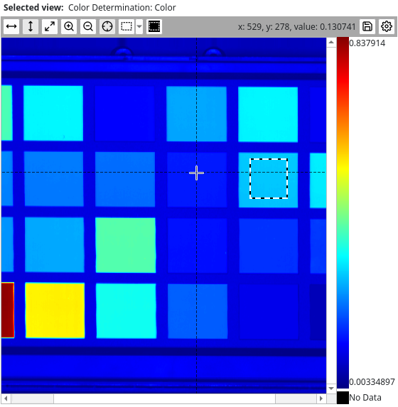
Pinpointing
The Pinpoint tool allows the user to
determine the value of the image at a specific point. Clicking the
button once enables the pinpoint tool. If the user moves the mouse
around in the image (without pressing any mouse button) a
crosshair will follow the mouse and the button bar will display the
x and y coordinates (the top-left corner will be at (1, 1)), as
well as the value of the image at that position:
Clicking within the image once at any positiion will exit the pinpoint tool, but it will lock in the current pinpoint value, so that the user can still see it:
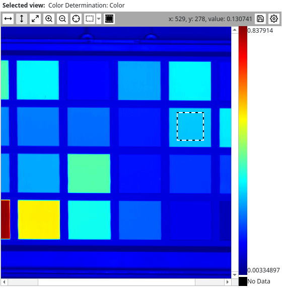
If the pixel in question was assigned to a specific group, the name of the group will also be displayed.
If the image view is not in Single Column Mode, the value of the image will not be displayed (as there is no single value to display), but the position (and potentially the group name) will.
Settings
The settings will often depend on the selected column mode.
For the Automatic Color Mode to be available the input data must consist of color values. The image view will automatically convert the color values from whatever input color space they are in into a corresponding color that the screen can display. The settings in that case will look like the following screenhost:
In the Single Column Mode the values of the input pixels can be mapped using a color map the user can select (see below). The user can choose to either visualize the average of all columns, or choose an initial column with the slider:
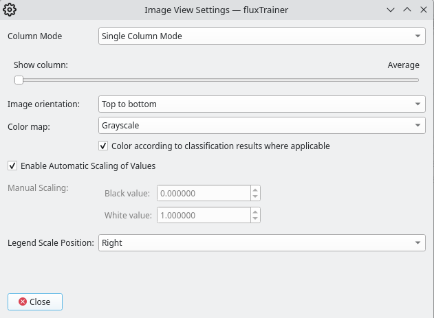
The average will only be available if it makes sense to average the columns. This will be true if the columns are different spectral bands in a HSI cube, or are color values that can be averaged to obtain an effective intensity (such as the XYZ and RGB color spaces). In other cases (such as with a CIE L*a*b* color space) it does not make sense to average the columns, and that option will not be provided.
The column selection slider will also display a label corresponding to the selected column. For example, if the user applies the Single Column Mode to HSI cubes, the wavelength corresponding to the selected column will be displayed in the settings.
In the Three Column Mode the user can artificially create a false-color image by selecting three columns to use for the red, green, and blue components:
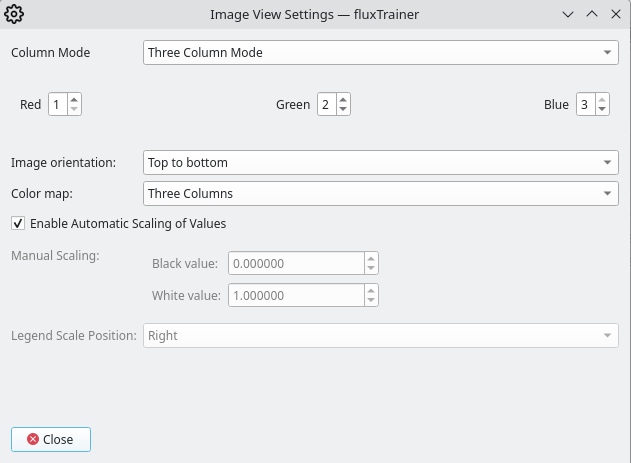
In that mode it will interpret individual columns as the red, green, and blue components of an RGB image. (The values are rescaled, see below.)
Rotating the Image
The Image Orientation setting allows the user to rotate the image in the view. The default setting Top to bottom will display the image in its natural orientation.
Single Column Mode: Color Map
In Single Column Mode the user has the option of selecting one of the following color maps:
Color Map |
Name |
|---|---|
|
Grayscale |
|
Autumn |
|
Bone |
|
Jet |
|
Winter |
|
Rainbow |
|
Ocean |
|
Summer |
|
Spring |
|
Cool |
|
HSV |
|
Pink |
|
Hot |
|
Parula |
|
Traffic Light |
|
Cividis |


There is an additional option, Color Code Groups, which corresponds to the Grayscale color map, but with an overlay that indicates which pixels were assigned to which groups based on the groups’ colors.
Three Column Mode: Color Map
In Three Column Mode there are only two possible color maps: Three Columns, and Color Code Groups. The Three Columns map indicates that just the basic three column mapping should be used to generate the image.
When choosing Color Code Groups an overlay to shade pixels that were assigned to groups is added, in the same manner that the overlay is added in the Single Column Mode if this is chosen.
Color according to classification results where applicable
This setting is only available in the Single Column Mode. If the input data is a classification result, the image view will display the color of the group (that was the classification result) of each pixel. The color map seting will be ignored in that case. If the input data is not a classification result, this setting will have no effect.
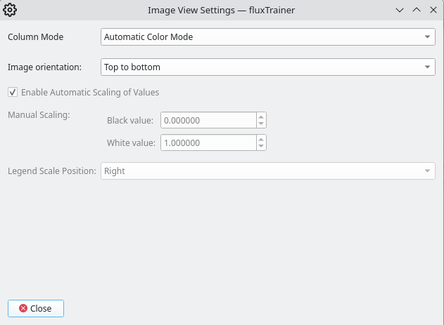
Scaling
In Single Column Mode the input data is mapped according to a user-selected color map (see below).
The Black value is the value assigned to the first color of the color map (which in a grayscale color map would be black). The White value is the value assigned to the last color of the color map (which in a grayscale color map would be white). Any color in between the black value and the white value will be mapped to an intermediate value in the color map (which in a grayscale color map would be a shade of gray). Any value lower than the black value will also be mapped to black, like any value higher than the white value will also be mapped to white.
By default, when Automatic Scaling is enabled, fluxTrainer will use te smallest value across all columns of the input data as the black value, and the largest value across all columns of the input data as the white value. If the user has selected the average over all columns (instead of a single column), the automatic scaling will determine the white and black values by just looking at the averages themselves, while the automatically detected white and black values for any specific column will always be determined from the smallest / largest values across all individual columns.
However, the user can disable Automatic Scaling and choose the black and white values of the data for themselves. This is useful if the input data either does not span the entire range it should have (and the automatic scaling exaggerates differences), or if the user wants to narrow the automatic range further to increase the visibility of smaller differences.
In Three Column Mode the black value (whether it be automatically detected or manually set) determines which value (and all values below it) completely disables the specified color channel. In the same vein does the white value determine which value (and all values above it) completely saturates the specified color channel.
Legend Scale Position
In Single Column Mode this setting allows the user to display a legend that shows the color map, as well as the black and white values (regardless of whether they were automatically determined or manually set). The drop-down has 5 options: Off (disables the legend), Left, Top, Right (the default), and Bottom.
In Three Column Mode and Automatic Color Mode the legend is not available and will always be hidden (as if it were set to Off).
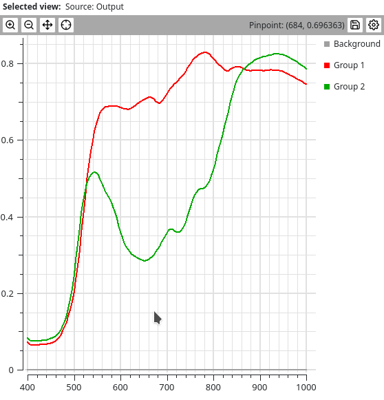
Chart View
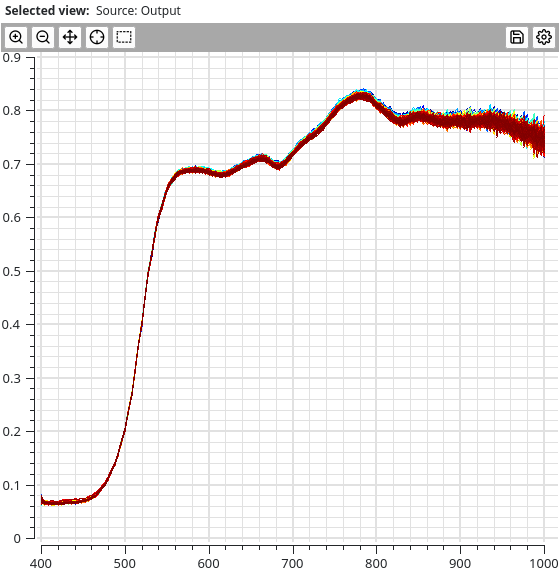
The chart view plots curves taken from the columns of the data. Most prominently, if the columns of its input data are spectral bands, it will plot one or more spectra.
The top bar of the chart view allows the user to customize the view. It consists of the following buttons:
Pan: Allows the user to pan within the chart by dragging the mouse in the chart’s area while having the left mouse button pressed. Clicking this button once will enter the Pan mode, clicking it again will exit the Pan mode again.
The chart will be plotted with the same elements that are visible in the current view, but potentially at a different scale, due to the custom size the user may specify here.
The chart view has 5 different primary display modes:
Individual Series
In this mode the chart view will plot up to 1000 selected series individually. Changing the selection in another view (for example an image view) will update which spectra are shown:
If the user has selected more than 1000 series, only the first 1000 series will be shown.
Each series will receive its own color, automatically assigned from the Jet color map (see the image view for details).
There is a variant of the individual series mode, when training-only data is being displayed. This could for example be the output of the Endmember Extraction Filter. The output of that filter does not participate in the global selection, so a chart view displaying the endmembers will always show all endmembers. (In that case the individual series mode will also show a legend if that is enabled in the settings.)
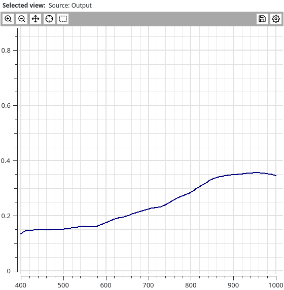
Average All
In this mode the chart view will average all input series (it will
ignore any that contain NaN values) and plot a single curve with
the average of all series:
Average Groups
If the user has defined groups and assigned pixels to those groups, this mode will allow the user to display the average series of each defined group:
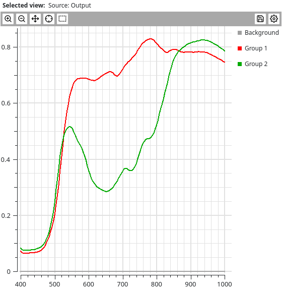
The group’s color will be used when plotting the curves.
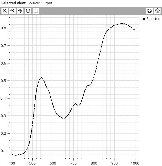
Average Selected Only
In this mode all selected series (no matter how many) will be averaged and that average will be plotted:
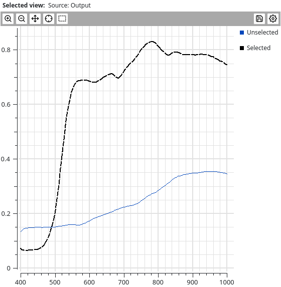
Average Selected and Unselected
In this mode all selected series will be averaged and plotted as a curve, and all unselected series will be averaged separately and plotted as a second curve:
Pinpointing
The Pinpoint tool allows the user to
determine the value of the closest series to the current mouse
position. Clicking the button once enables the pinpoint tool. If
the user moves the mouse around in the chart (without pressing
any mouse button) a crosshair will snap to the closest curve and
the button bar will display the x and y coordinates of that
position:
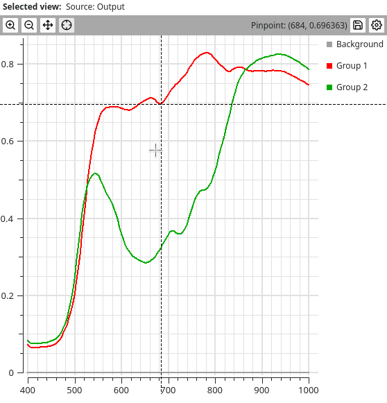
Clicking within the image once at any positiion will exit the pinpoint tool, but it will lock in the current pinpoint value, so that the user can still see it:
Settings
The chart view settings window will provide the following options to the user:
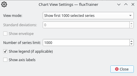
View mode
This switches the view mode between the various view modes available to the chart view.
Show legend
Enables or disables the legend (if applicable).
In any of the averaging modes a legend will be displayed if this option is enabled.
In individual series mode the view will only display a legend if the input data is training-only and does not participate in the global selection. Since in that case all series will be displayed, a legend is also shown to allow the user to distinguish between the various series.
Show axis labels
This setting enables x and y axis labels to indicate what kind of data is being displayed.
Number of series limit
This setting is only available in individual series mode. This allows the user to fine-tune the limit of the number of series that will be plotted.
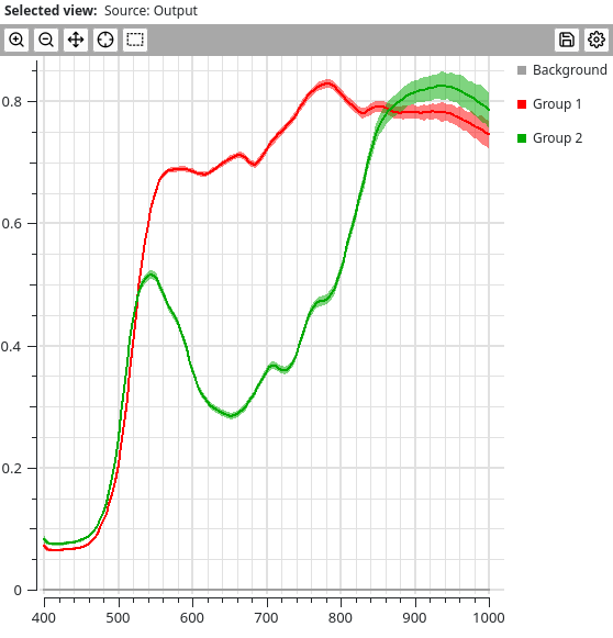
Standard Deviations
This setting is only available in the averaging modes. If enabled the plot will not only show the average series, but also an area around it that has a size given by the number of standard deviations configured here. The area will have the same color as the underlying series, but will be semi-transparent so that it can be distinguished from the actual series:
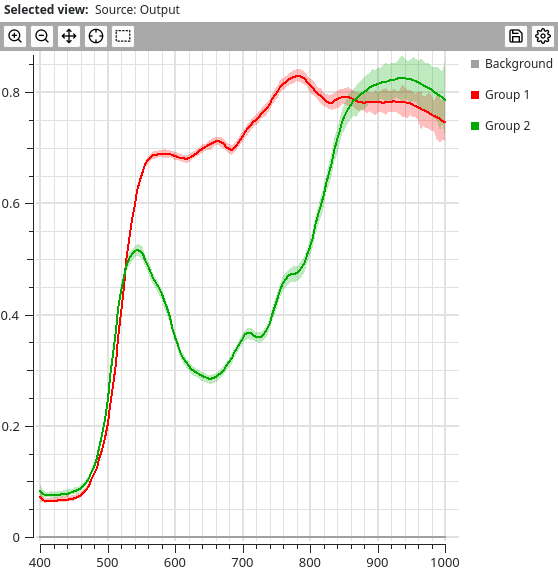
Show envelope
Only available in the averaging modes. If enabled the plot will additionally show an area behind each plotted curve that shows the envelope of all of the series that contributed to the average. This means that all series that were averaged and contributed to the average curve will fit within that area. Like the areas created when plotting standard deviations, this will also be semi-transparent, but even lighter than the curves related to the standard deviation:
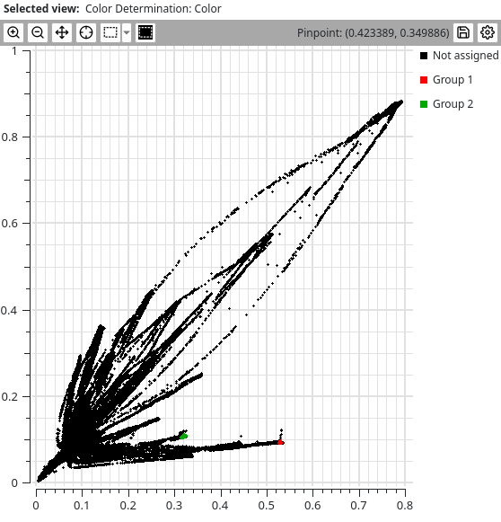
Scatter Plot View
The scatter plot view allows the user to display all data points in a scatter plot, where the x and y coordinates are taken from different columns of the same output.

Each pixel corresponds to a single point that is plotted in the scatter view. The points are black by default, unless they are assigned to a specific group, in which case the points are colored with the color of the group.
If a point is currently selected, it will have a white border and the point size will be increased:

The top bar of the image view allows the user to customize the view. It consists of the following buttons:
The user may either press the left mouse button and generate a shape by dragging it within the image. When releasing the button the end point where the user released the button will be connected with the start point where the user initially pressed it, and all points within the shape that is enclosed by this contour will be selected.
Alternatively the user may click in the image once, then click at another point in the image again. This will start a polygon connecting each vertex clicked by the user by a straight line. To complete this type of selection the user must click on the first vertex of the polygon, at which point all data points within that shape will be selected.
Holding the shift or control keys while completing new selections in either of these modes will not replace the current selection by the new shape, but either add the newly defined shape to the current selection (shift key), or subtract the newly defined shape from the current selection (control key).
If the scatter plot view is configured to show only pixels from the currently selected cube, and pixels from other cubes were previously selected, those will be unselected entirely though. (And no pixels from other cubes will be selected.)
The scatter plot will be plotted with the same elements that are visible in the current view, but potentially at a different scale, due to the custom size the user may specify here.
Pinpointing
The Pinpoint tool allows the user to
determine the value of the closest point to the current mouse
position. Clicking the button once enables the pinpoint tool. If
the user moves the mouse around in the chart (without pressing
any mouse button) a crosshair will snap to the closest curve and
the button bar will display the x and y coordinates of that position:

Clicking within the image once at any positiion will exit the pinpoint tool, but it will lock in the current pinpoint value, so that the user can still see it:
Settings
The scatter plot view has the following settings:
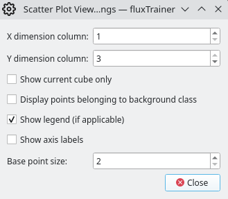
X/Y dimension column
Here the user may select which column to use as the x value of each point, and which column to use as the y value of each point.
Show current cube only
By default the scatter plot view will display points from all loaded cubes at once. Activating this option will restrict the scatter plot view to only show the points belonging to the current cube.
Display points belonging to background class
If the user has assigned points to the implicit background group they will be hidden by default. If this option is active, they will not be hidden.
Show legend
Enables or disables the legend of the scatter plot. Since the points are colored according to their group assignments, the legend will contain a list of all groups that had points assigned to them.
Show axis labels
Enables or disables the axis labels of the x and y axes that give the user a better indication of what quantities are being plotted against each other.
Base point size
Allows the user to specify how big the points in the scatter plot should be (in pixels).
Histogram View
The histogram view allows the user to obtain a histogram over the input data. It will automatically sort the input values into a user-defined number of bins:
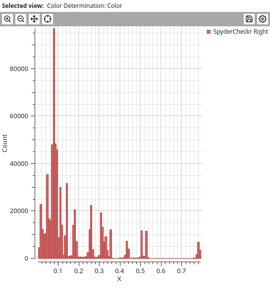
The view will always provide separate histograms for the data from different loaded cubes. By default it will only show a single cube, however.
The histogram is always generated for a single column that the user can select in the settings.
The top bar of the image view allows the user to customize the view. It consists of the following buttons:
The scatter plot will be plotted with the same elements that are visible in the current view, but potentially at a different scale, due to the custom size the user may specify here.
Pinpointing
The Pinpoint tool allows the user to
determine the position of the mouse in the plot. Clicking the button
once enables the pinpoint tool. If the user moves the mouse around
in the chart (without pressing any mouse button) a crosshair will
appear that follows the mouse. The button bar will display the the
x and y coordinates of the mouse within the plot:

Clicking within the plot once at any positiion will exit the pinpoint tool, but it will lock in the current pinpoint value, so that the user can still see it:

Settings
The histogram view has the following settings:
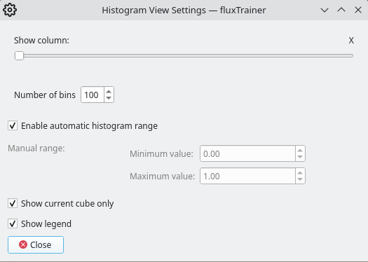
Show column
The user can select for which column the histogram should be calculated.
Number of bins
The user can configure how many bins the histogram should have.
Histogram range
By default the histogram view will automatically select the histogram range from the largest and smallest values in the input data. This can be overridden by the user and the user can specify minimum and maximum values themselves.
Show current cube only
If enabled (default) only one histogram of the current cube will be shown. If disabled and multiple cubes are present in the current project, multiple histograms, one for each cube, will be shown.
Show legend
Whether to show the legend that indicates to the user which histogram corresponds to which loaded cube.
Table View
The table view displays data in table form. The rows denote the pixel or series, the columns denote the channels of each pixel/series:
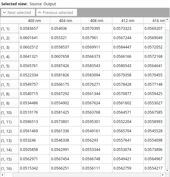
This screenshot shows the table view displaying the data of a HSI cube. The columns are the spectral bands of the data, and the rows are the individual pixels of the cube.
When the rows are pixels the row headings will be of the form
(y, x), starting at (1, 1).
The table view will only display the elements belonging to the currently selected cube.
Selections
The table view allows the user to toggle the selection of rows by clicking on the row itself. If the row was previously not selected, it will be selected after clicking on it, and vice-versa.
The table view also has two buttons in the button bar:
Next Selected scrolls the view so that the next selected row that is beyond the current scroll area is now at the top.
Previous selected scrolls the view so that the previous selected row that is before the current scroll area is now at the bottom.
Object Region Data
The table view changes when displaying object lists that have object regions that are defined. See the documentation for the Object Region Averaging Filter for further details.
Chart Comparison View
The chart comparison view works in the same manner as the chart view, but the user can use it to compare two different inputs. The inputs will be plotted in different colors that the user can select in the settings:
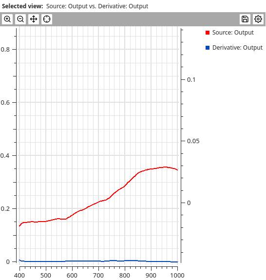
The behavior and settings of the chart view are very similar to those of the chart view that just displays curves of a single output. The main differences are:
There is no to average both selected and unselected series
In individual series mode, average all series mode, and average selected selected series mode the colors of the inputs are determined by the colors selected by the user (by default red and blue) for the individual inputs. In individual series mode all series of a given input will be drawn in the same color.
In the average groups mode the colors are determined by the groups, but the second input’s curves are drawn with a dashed line, while the first input’s curves are drawn with a solid line
Settings
Most options are equivalent to the chart view, but there is also the option for the user to define the colors for the different inputs.
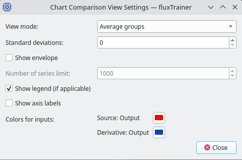
Clicking on the buttons with the current color will open a window that allows the user to pick the color they want to use for the input. (How the window looks like will depend on the operating system.)
Scatter Plot Comparison View
The scatter plot comparison view behaves identically to the scatter plot view, with the exception that the X axis is a user-specified column of the first input, and the Y axis is a user-specified column of the second input. (In the scatter plot view, both axes are columns from the first and only input.)